本文最后更新于:2021年8月30日 早上
背景
grid 可视化布局, css grid 完整指南
早就知道 css grid 布局非常强大,但之前由于兼容性问题一直没有机会尝试,近来在生产环境中大规模尝试使用它,并尝试在 react 中进行封装:在 react 中优雅的使用 grid 实现页面布局,于此记录一下各种常见布局的 grid 实现。
附:grid 真的是一个非常强大自适应布局系统。
示例
注:以下示例均默认引用了 Normalize.css
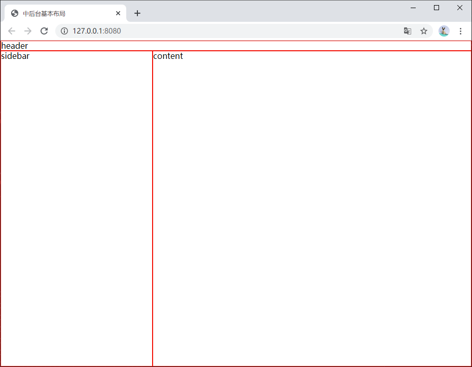
中后台基本布局
1
2
3
4
5
6
7
8
9
10
11
12
13
14
15
16
17
18
19
20
21
22
23
24
25
26
27
28
29
| <body>
<style>
html,
body,
.container {
height: 100%;
}
.container {
display: grid;
grid-template-columns: 300px 1fr;
grid-template-rows: auto 1fr;
grid-template-areas: 'header header';
}
.header {
grid-area: header;
}
.container > * {
border: solid 1px red;
}
</style>
<div class="container">
<header class="header">header</header>
<section>sidebar</section>
<section>content</section>
</div>
</body>
|
中后台基本布局.html
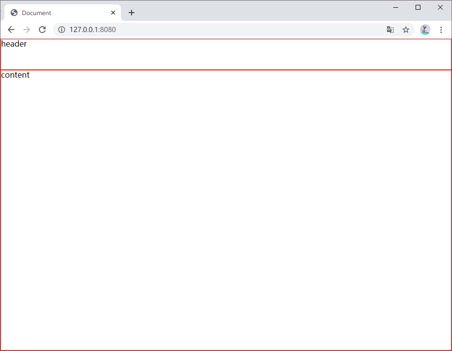
纵向布局
1
2
3
4
5
6
7
8
9
10
11
12
13
14
15
16
17
18
19
20
21
22
23
24
25
26
| <body>
<style>
html,
body,
.container {
height: 100%;
}
.container {
display: grid;
grid-template-rows: auto 1fr;
}
.container > * {
border: solid 1px red;
}
</style>
<div class="container">
<header>header</header>
<section>content</section>
</div>
</body>
|
纵向布局.html
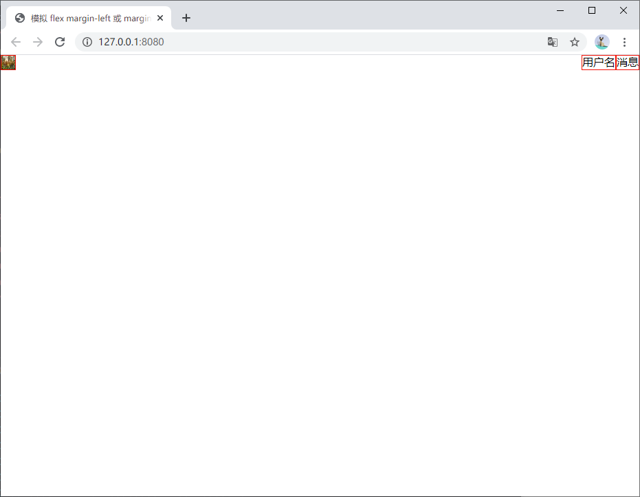
模拟 flex margin-left 或 margin-right
1
2
3
4
5
6
7
8
9
10
11
12
13
14
15
16
17
18
19
| <body>
<style>
.container {
display: grid;
grid-template-columns: auto 1fr auto;
justify-items: end;
}
.container > * {
border: solid 1px red;
}
</style>
<header class="container">
<img src="https://picsum.photos/20" alt="logo" />
<div>用户名</div>
<div>消息</div>
</header>
</body>
|
模拟 flex margin-left 或 margin-right.html
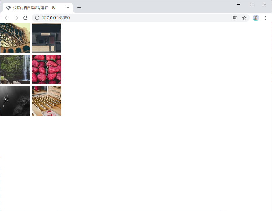
根据内容自适应贴靠在一边
如下图展示一个图片列表
1
2
3
4
5
6
7
8
9
10
11
12
13
14
15
16
17
18
19
| <body>
<style>
.container {
display: grid;
grid-template-columns: auto auto;
justify-content: start;
grid-gap: 8px;
}
</style>
<section class="container">
<img src="https://picsum.photos/seed/1/100" />
<img src="https://picsum.photos/seed/2/100" />
<img src="https://picsum.photos/seed/3/100" />
<img src="https://picsum.photos/seed/4/100" />
<img src="https://picsum.photos/seed/5/100" />
<img src="https://picsum.photos/seed/6/100" />
</section>
</body>
|
根据内容自适应贴靠在一边.html
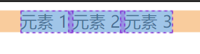
针对任意数量的元素水平布局(替代 flex)
1
2
3
4
5
| .container {
display: grid;
grid-auto-flow: column;
}
|
可以很容易实现居中布局
针对任意数量的元素水平布局.html
真实案例
嵌套的 grid 布局,外层处理横向布局,内层用以垂直对齐图片和文字。
纵向布局,内容区域自适应撑高容器到 100%。